

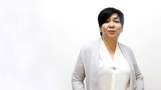


First impressions are brutal, let’s face it. All it takes is seven seconds for someone to build a first impression of you, and the worst part is, there won’t be a second chance given to build another first impression. And contrary to what people usually assume, first impressions are now not just when you first meet someone. It is in fact, when someone first get acquainted with you regardless of the medium. It could be a glance at your LinkedIn profile, or a quick search on social media platforms of you. Which is why, it is so vital for everyone to understand that a corporate picture can sometimes create a positive connection or leave a sour taste after.
As an image consultant, I have been asked by many on what to take note of. Is it the way you stand? The way you smile? Or the clothes you wear? Those are frequent questions asked, however today I would like to talk about an aspect often overlooked: colour. You see, colour is the most essential step in wardrobe selection, from an image consultant’s point of view.
This is because wearing the right colour for your skin tone can really accentuate your features, making you look fresh and energised, whereas conversely, choosing the wrong colours would result in the individual looking washed out, drained and in some cases, if the colour is too strong for your skin tone, you end up having the colour “overpowering” you.
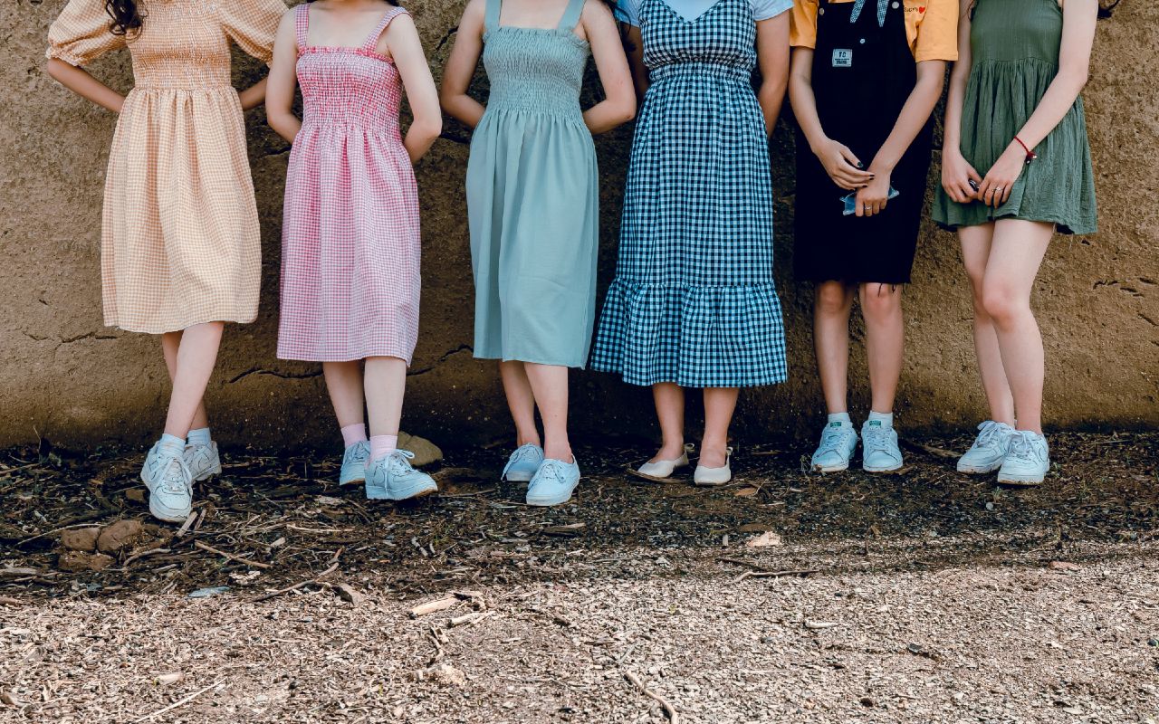
Which is why in some cases, perhaps you have heard people complimenting you by saying “Oh wow the dress/shirt you are wearing is really pretty!” That, ladies is not really a compliment to YOU. It is a compliment to the outfit you are wearing. The real compliment should have been: “Oh wow, you look so good in that dress/shirt.”!
Having stated my case, I would like to offer some useful tips in this article on colour selection, when you decide on what outfit to wear when you are getting your photo taken. Firstly, colour selection needs to be considered for the following parts of your look: Makeup for women, hair colour, tie for men, as well as the top and/or blazer that you would be wearing. What this means is that anything in your look that is nearest to your face needs to be properly considered. This is because the function of the right colour is to reflect onto your face, creating a glow. There is no use if you are wearing a less suitable colour as a top and a more suitable colour as the bottom.
Now that’s addressed, let’s dive into the part of understanding what colours would look best on you. Colour analysis is usually largely divided into warm or cool colour categories. In order to identify which category you fall into, take a look at your wrist area and have a look at the colour of your veins as well as your skin undertone at that region. For the best effects, do this with natural sunlight or under white light to avoid any misjudgements.
For individuals with greenish veins and yellow undertones, you are in the warm colour category. And for individuals with blueish/purplish veins, with a more pinkish skin undertone, then you are in the cool colour category. Another tell-tale sign on the difference of category is how your skin reacts to the sun. For warm toned individuals, you generally get tanner, while for cool toned individuals, you usually get sunburned pretty easily. Take a look at the pictures below to give you a better idea on which tone you are:
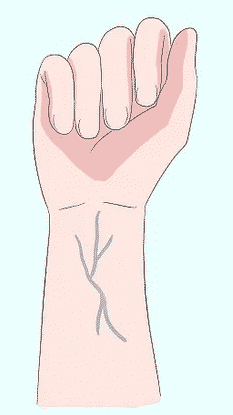
Cool Toned 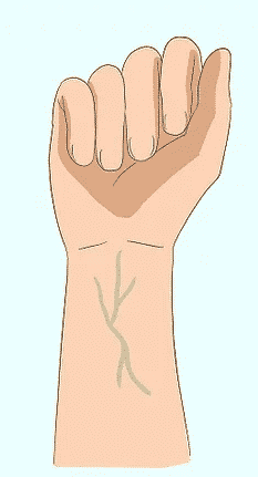
Warm Toned
For the warm toned individuals, you generally look good in colours with warmer tones, such as earth based or colours with white base to it (as shown in picture below). And for the cool toned individual, you look best in colours that are on the ends of the spectrum, which are tones such as pastel, dusty colours, to colours that are deep and rich, such as jet black, emerald green. The colour charts below, along with the example of celebrities would give you a good idea of what colours would suit you best.
Warm Toned Colour Scheme
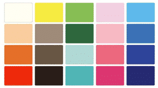
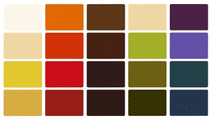

Photo credit: tvovermind.com 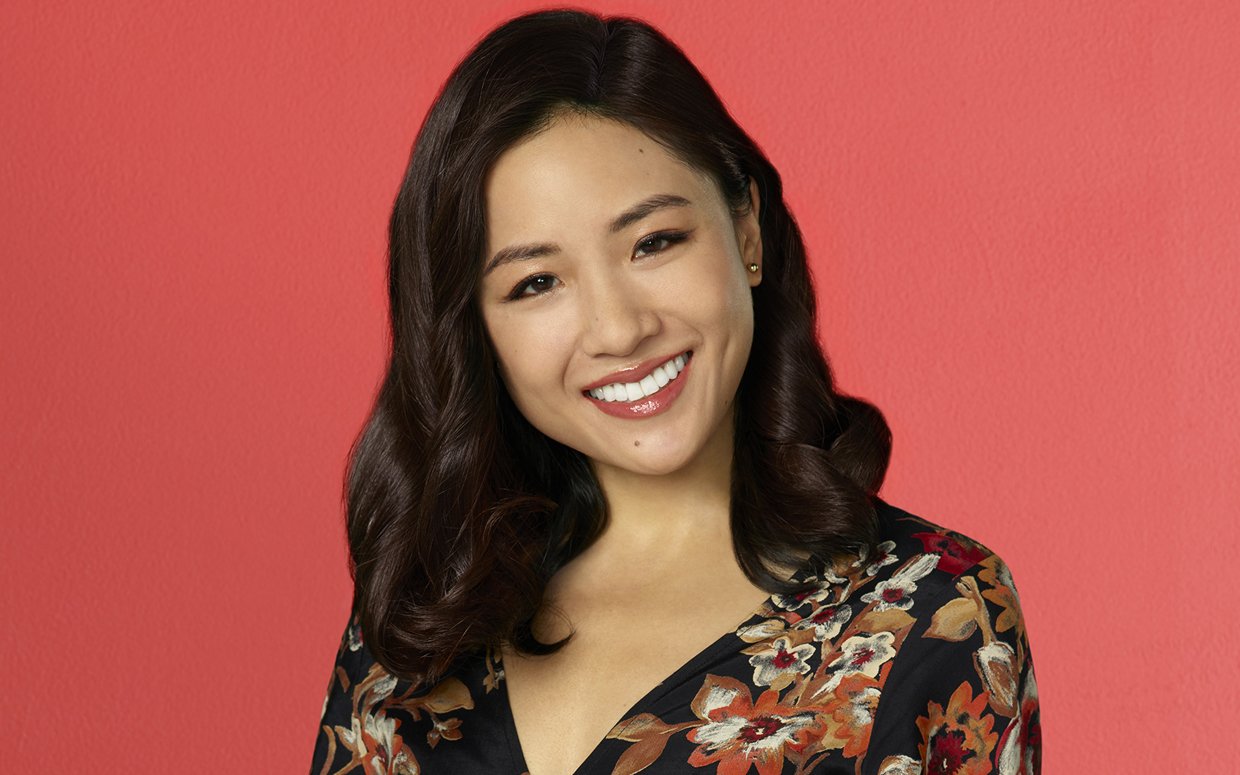
Photo credit: Parade Daily
Cool Toned Color Scheme
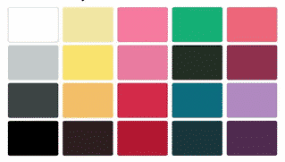

Photo credit: www.soompi.com 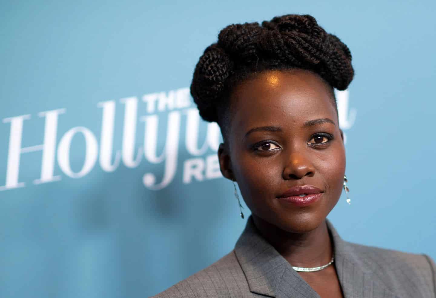
Photo credit: The Boston Globe
I hope that this colour suitability tip would be able to help you further enhance your image and to be able to ensure that your headshot would be the best representation of yourself to prospects.
This is a general information as a start of understanding the importance of colors but for a more accurate understanding of color ,please do consult an image consultant for a thorough color assessment.
All the best people!


KH.LIM
24th April 2020 at 2:12 pm
Thank you Ranukka for your sharing. i truely agree with wat you have said. Is such insightful article. Thanks again