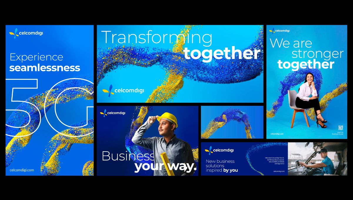
CelcomDigi Berhad, the result of a merger between two renowned Malaysian telco giants, Celcom and Digi, has made a significant leap forward. The company proudly announces the launch of its new corporate identity, which includes an innovative sonic logo. This move marks the brand’s ambition to become the leading telco-tech company in the nation, harnessing a combined legacy of 60 years, the expertise of 4,000 industry professionals, and a massive base of 20 million customers.
Merging Legacies with a Futuristic Vision
Design Bridge and Partners have been instrumental in crafting this new identity. They have successfully blended algorithmic design to maintain the essence of the original brands while injecting a fresh and exciting vision. Cecylia Grendowicz, Strategy Director at Design Bridge and Partners Hong Kong, explains the complexity and success of this venture: “Successful M&A’s can increase value or accelerate growth of a business – allowing a company to grow at a rate that would not be possible through organic growth. However, merging these two iconic brands was an interesting challenge. How can we preserve the much-loved personality and equity of both brands to show continuity, while also creating some excitement, setting a bold future vision and demonstrating new value to the market? We collaborated closely with the team at CelcomDigi to create a dynamic and optimistic brand spirit and identity that feels familiar, yet forward-thinking at the same time. Demonstrating to Malaysia that in this case, 1 + 1 = 3.”
Symbolism in Colors and Design
Celcom’s legacy of trust and credibility, symbolized by the color blue, and Digi’s energy and innovation, represented by yellow, are seamlessly integrated into CelcomDigi’s identity. This amalgamation is not just a merging of colors but also a fusion of values and visions, culminating in a unique visual of a world composed of particles. These particles represent every individual in the CelcomDigi network, unified under the new tagline ‘Creating a world inspired by you’.
Aslo read: MPMG Triumphs on TikTok: Philippine Fashion’s New Vanguard
A Transformative Logomark and Generative Design
The new logomark, unveiled in October, signifies a bold era of transformation. CelcomDigi has employed generative design, an algorithmic tool, to create distinct brand assets. This innovative approach symbolizes the brand’s belief in infinite possibilities, representing a bright future for Malaysia.
The Power of Sonic Branding
Adding to the visual identity, CelcomDigi has introduced a sonic logo developed in collaboration with Two AM Music. This logo features a four-note melody adaptable across various audio assets, further strengthening the brand’s connection with consumers.
Proving Success with Strong Performance
CelcomDigi’s recent announcement of its third-quarter results for 2023 shows promising growth, with a significant increase in total subscribers. This indicates that the newly merged brand is set on a path of success and continued innovation.
For further information on CelcomDigi’s transformative journey and to explore their new brand identity, visit www.celcomdigi.com.
Legal Disclaimer: The Editor provides this news content "as is," without any warranty of any kind. We disclaim all responsibility and liability for the accuracy, content, images, videos, licenses, completeness, legality, or reliability of the information contained in this article. For any complaints or copyright concerns regarding this article, please contact the author mentioned above.


