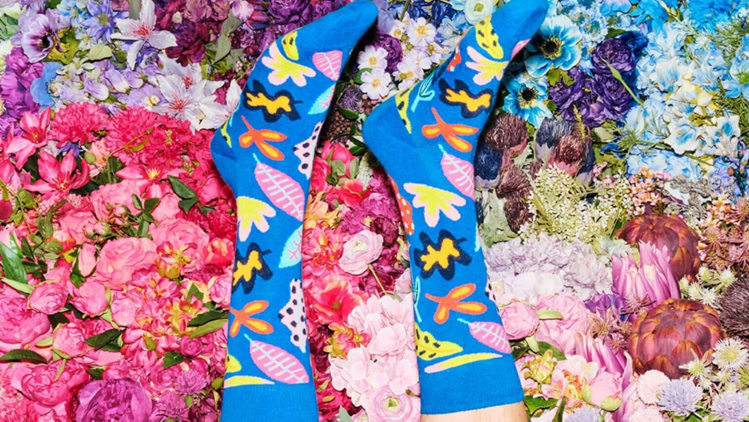
Renowned Swedish accessories brand, Happy Socks, recently unveiled a fresh look with an updated brand identity, including an intriguing new logo and refined product branding. To celebrate this vivid transformation, the brand collaborated with 18 artists to launch a special collection that beautifully encapsulates its refreshed appearance.
Working closely with Paris-based agency Yorgo&Co, the redesigned visual identity was crafted to remain consistent with Happy Socks’ core values – being bold, joyful, and perpetually playful. Simultaneously, the rejuvenated look aspires to welcome and engage customers into the colorful world of Happy Socks.
Also Read: Tesla Makes Strategic Move in India: New Office Space Secured in Pune
Art director from Yorgo&Co, Yorgo Tloupas, aimed to “iconise the brand”, supplementing an already iconic label with an easily identifiable symbol. This new emblem needed to stand out, radiate happiness, and be intrinsically linked with the Happy Socks name.
The new logo, an interesting interplay of the letters ‘H’ and ‘S’, is an endearing character with curious eyes and a subtle smile. This playful character comes alive with captivating animations for digital applications, embodying the effervescent spirit of the brand.
As the brand ushers in a fresh era, the Chief Marketing Officer, Laura Fris, shares that the updated visual identity exemplifies the brand’s journey, mirroring its unwavering commitment to innovation and creativity.
To mark the commencement of this new chapter, Happy Socks initiated an exciting collaboration named “18 Interpretations of Happiness”. This unique project explores the artistic perception of happiness through 18 distinguished artists. Each artist presents a pictorial depiction of their ideal day, their feet stylishly adorned with Happy Socks, capturing joyous moments mid-air.
Among the artists are Stockholm-based colorist and designer Tekla Severin, New York-based photography duo Stevie Verroca and Mada Refujio, and French multimedia artist Robin Lopvet.
Happy Socks, however, isn’t the only company engaging in a brand refresh. Global coworking space provider WeWork also recently debuted its rejuvenated brand identity. Aiming to modernize while preserving the brand’s essence, the rebrand was spearheaded by WeWork and creative brand agency Franklyn. It features an updated logo, color scheme, hand-drawn illustrations of people and spaces, and a custom typeface available across all WeWork channels.
In conclusion, Happy Socks’ new brand identity marks a significant milestone in the brand’s journey, setting a powerful precedent for other companies looking to invigorate their look and connect more deeply with their customers. This rebranding strategy, including innovative logo design and artist collaborations, illustrates the brand’s unique commitment to joy, creativity, and constant evolution.
This news is based on a report by Marketing Interactive.


