Introduction
You see it every day. A company uses a certain color in its logo or on its packaging and suddenly you start to feel a certain way. Maybe you feel happy and excited when you see a bright yellow McDonald’s bag, or maybe the sight of a deep purple makes you feel calm and relaxed.
What you might not realize is that the companies behind these colors and typefaces are using design principles to influence your emotions and, in turn, your spending habits. In this article, we’ll explore how color and typography can be used to create different moods and impressions in consumers. We’ll also discuss how to choose the right colors and typefaces for your brand.
How Colors Influence Consumers
When you’re designing a brand, it’s important to consider how color will influence your consumers. Different colors can communicate different things, and it’s important to choose the right ones to represent your brand.
Blue is often seen as calming and dependable, which is why it’s often used by banks and other financial institutions.
Green is seen as fresh and natural, making it a popular choice for brands that sell organic products.
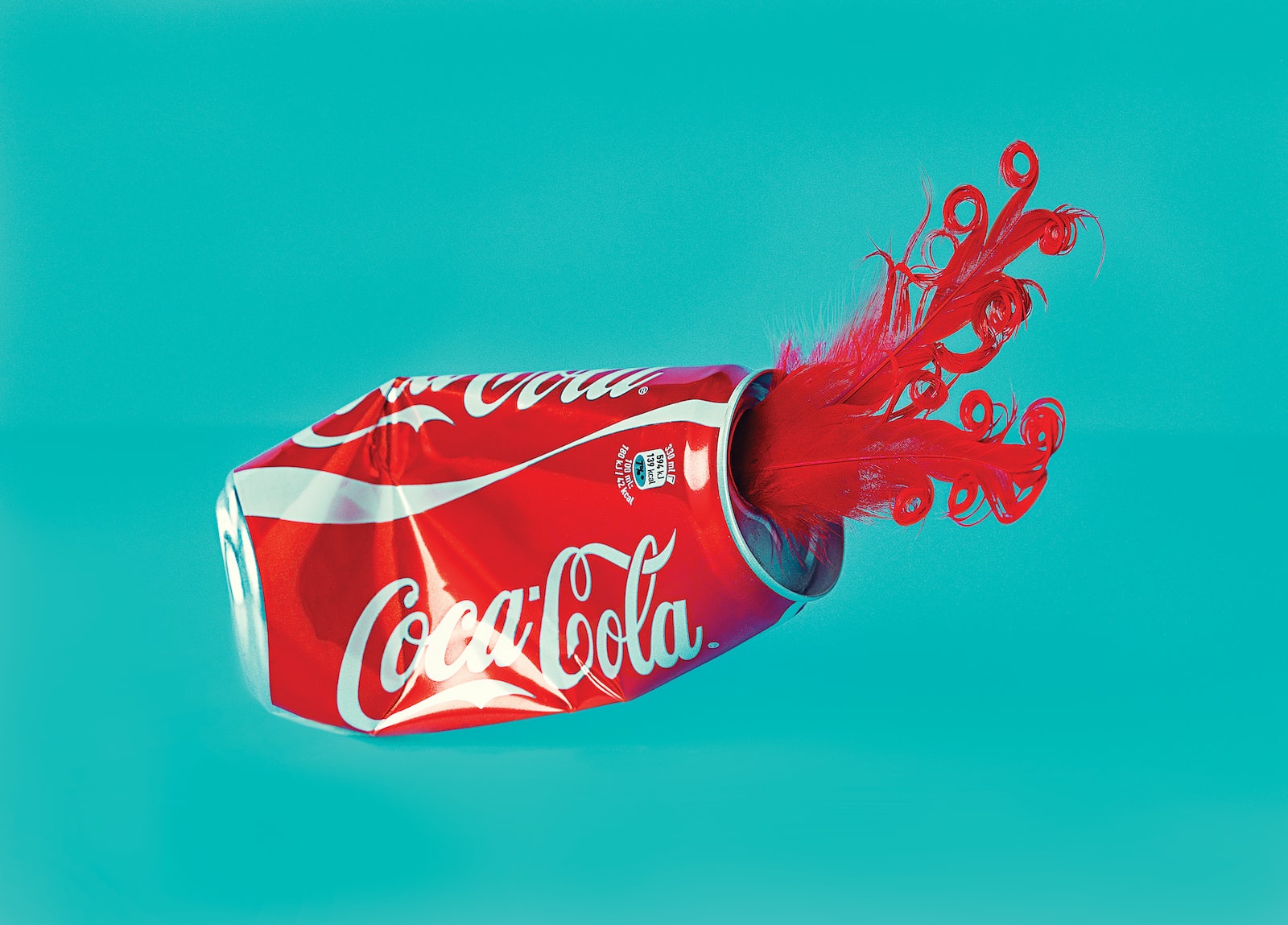
Red is associated with excitement and energy, making it a good choice for brands that want to create a dynamic image.
It’s not just the color of your logo that matters, either. The color of your packaging and advertising materials will also play a role in how your customers see your brand. If you’re targeting a particular demographic, you’ll need to take into account their cultural associations with color.
How Typography Influences Consumers
Typography is just as important as color when it comes to branding. Different fonts can create different moods and emotions, which is why it’s important to choose the right one for your brand.
Serif fonts are often seen as classic and traditional, while sans-serif fonts are seen as modern and minimalist. Script fonts are often associated with femininity, while bold fonts are seen as masculine. It’s important to choose a font that matches the image you want to create for your brand.
What Colors Mean in Branding
When it comes to color, different hues can have different effects on consumers. Here are a few things to consider:
- Black is often seen as authoritative and serious. It can be used to create a feeling of luxury or high-end quality.
- Blue is seen as calming and trustworthy. It can be used in branding to suggest reliability and security.
- Gold is seen as luxurious and valuable. It can be used in branding to communicate richness and premium quality.
- Green is seen as healthy and environmentally friendly. It can be used in branding to suggest sustainability and integrity.
- Red is seen as energetic and passionate. It can be used in branding to create excitement or urgency.
- Orange is seen as fun and youthful. It can be used in branding to target a younger demographic.
- Purple is seen as creative and imaginative. It can be used in branding to suggest luxury and sophistication.
How to Use Color Psychology in Branding
Think about the last time you walked into a store and were immediately drawn to a particular product. Maybe it was the brightly-colored packaging or the eye-catching typography. Chances are, the color and typography were used strategically to influence your purchasing decision.
Color psychology is the study of how colors influence our emotions and behaviors. It can be used in branding to create a desired emotional response from consumers. For example, red is associated with excitement and aggression, so a company could use it in their branding to create an energetic and active tone.
Similarly, typography can be used to create a certain feeling or impression. Serif fonts, which have those little flourishes on the ends of the letters, are often seen as more classic and formal, while sans-serif fonts are considered more contemporary. So if you’re going for a modern look, you would use a sans-serif font.
By understanding color psychology and typography, you can use them to create a more cohesive and effective brand design.
What Typography Says About Your Brand
Your typography says a lot about your brand. It can convey the feeling of your brand, communicate your brand message, and influence your target audience.
Your font choices should be purposeful and intentional. They should be carefully chosen to reflect the feelings you want your brand to evoke. For example, using a vintage font can make your brand feel more established, while using a modern font can make your brand feel more trendy.
Your typography should also be legible and easy to read. If your target audience has to strain to read your text, they’re not going to stick around for long. And finally, your typography should be consistent across all of your marketing materials. This will help create a cohesive and recognizable brand identity.
How to Use Typography in Branding
You can use typography to create a visual hierarchy, which is the order in which your audience will process the information on your page. To do this, you’ll want to use different font sizes, weights, and styles.
Here’s an example: Let’s say you’re creating a blog post about the benefits of color in branding. The title of your blog post might be in a larger font size than the body copy, and the subheadings within the blog post might be in a different color or font style than the rest of the text. This helps your readers know what information is most important and makes it easier for them to scan your content.
When choosing fonts for your brand, it’s important to consider both legibility and personality. For instance, you wouldn’t want to use an overly decorative font for a business that sells products or services that are intended for children, as it would be difficult for parents to read. However, if you’re selling products or services that are targeted toward creative professionals, you might want to use a more unique or experimental font.
Ultimately, the best way to figure out what fonts work best for your brand is to experiment and see what feels right.
Conclusion
When it comes to branding, color and typography are two of the most important elements to consider. Color can influence a consumer’s emotions and perceptions, while typography can help to create a visual hierarchy that makes your brand more easily recognizable.
By understanding how color and typography influence consumers, you can create a more effective branding strategy that will help your business to stand out from the competition.


