Jell-O Springs into New Era with Vibrant Branding
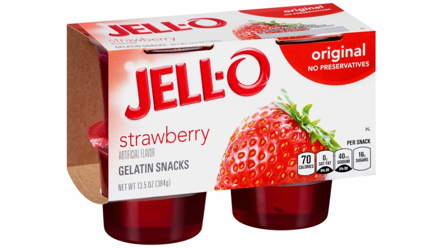
Jell-O is taking a vibrant leap forward. The brand, steeped in nostalgia, now flaunts a refreshed packaging and a revamped logo. The goal? To resonate with today’s parents and their kids using a simple yet colorful design language. After a decade, Jell-O chose this moment for its brand rejuvenation.
Global branding experts, BrandOpus, played a pivotal role in this transformation. The new face of Jell-O, spanning its pudding, gelatin, cups, and boxes, is their collective brainchild.
Also Read: Wipro Collaborates with IIT Delhi to Launch AI Center of Excellence
Rebecca William, the creative brain at BrandOpus, shared her excitement about the project. The team’s ambition was clear. They wanted to rekindle the “jiggly fun”, emphasizing the brand’s appeal to all ages. William reiterated the sheer joy the team felt while breathing new life into this beloved brand.
The revamped logo now commands attention with its amplified simplicity. A pronounced graphic drop shadow gives it prominence. Yet, the iconic ‘O’ in Jell-O remains, receiving greater emphasis than before. Gone are the real fruit images from the packaging. Instead, they’ve made way for vibrant, fun illustrations.
Kraft Singles Joins the Rebranding Bandwagon
Jell-O is not alone in its brand evolution journey. Kraft Singles recently unveiled its new avatar too. The cheese brand responded to years of customer feedback, mostly complaints about the tricky packaging. CNN reported that this cheese icon has taken user feedback seriously.
The problem? Customers often struggled with the clear wrapper of the individual cheese slices. Kraft Singles addressed this with innovative packaging. Each slice now has a tactile flap, making it easier to locate and open. Moreover, the material feels robust, eliminating the annoyance of unintentionally torn plastic.
But the innovations aren’t just functional. Kraft Singles’ external packaging has also undergone a visual transformation. The logo now shines with a clearer, bolder typography. And there’s a strong emphasis on product integrity – no artificial flavors, colors, or preservatives, and a commitment to using real dairy.
Both Jell-O and Kraft Singles’ rebranding stories signify a common theme. Brands, no matter how iconic, need to listen, adapt, and evolve. In a world where consumer feedback is louder than ever, these brand makeovers are testament to the importance of staying relevant.
Information for this article is sourced from Marketing Interactive.


